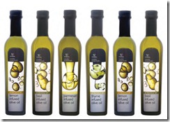
When major retail brand, Woolworths of Cape Town, in the Republic of South Africa, launched a new range of cooking oils, dessert sauces, syrups and glazes as part of a new product line called ‘Cooks’ Essentials’, Rotolabel was immediately approached to produce the labels for this new, premium product range. Also in Cape Town, Rotolabel is one of South Africa’s leading producers of self-adhesive labels and an existing supplier to Woolworths.
“Our company specialises in high-quality label printing and has a reputation for providing a dedicated, reliable service to its customers,” said Grant Watson, sales director, Rotolabel. “To provide this high-end service,
we have a number of letterpress machines and an HP Indigo press ws4500 at our disposal. We purchased the HP Indigo press about four years ago, and Woolworths was just one of the food and wine retailers that were attracted to our new print capabilities. The
increased quality of our digitally printed labels won us many new customers requiring packaging for premium products, and our HP Indigo press continues to enhance
our offering as a supplier of high-quality print services.”
Steve Andrews, packaging, design and planning manager, Woolworths commented, “We needed a trustworthy print service provider that would be able to take the concept for the new product labels from final artwork stage to the finished product. Having worked
with Rotolabel before, we knew that they would be ideally suited for this job and having HP Indigo print capabilities made the decision to place the work with them even easier.”
Maintaining consistent, high quality The ‘Cooks’ Essentials’ product range is aimed at
experienced cooks and cooking enthusiasts and therefore, the packaging design and finished quality of the product needed to attract this semi-professional market with a high-end look and feel.
“To achieve this premium look, one of the features of the new label design was a metallic effect at the bottom of all the labels. Critical to the appearance of the label and ultimately, the success of the new range, this effect needed to be fresh, clean, balanced and bright,”
explained Andrews. “Rotolabel conducted numerous tests to ensure the required result was achieved.”

Comments
Post a Comment