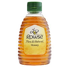
RPC Llantrisant has created eye-catching new bottles for the high-profile relaunch of a leading UK honey brand.
Rowse Honey has used the theme of a honeycomb as the design basis for its new packaging. The custom-moulded bottles therefore needed to incorporate a hexagonal pattern, as well as providing space for improved labelling with a hand-written feel.
As a result, the lightweight PET squeezy bottles created by RPC Llantrisant now feature a hexagonal recess instead of the previous torpedo-shape.
RPC Llantrisant designer Dean Williams says: "The design brief was to make slight changes to the bottles, in line with the outline designs that Rowse had supplied to us.
"The label panel shape was the main change on the range, as the basic shape of the bottle was maintained.”
The range includes 340g and 680g bottles with flip-top caps and a 1.36kg variant with a valve cap. The recyclable bottles are manufactured on single stage, Aoki injection stretch blow moulding machines.
"The bottles had to be introduced smoothly onto Rowse’s filling lines without any major disruption to production. All the preform tooling used for the bottles was new and custom made to blow the Rowse shapes,” adds Dean.
"Squeezability of the packs was important to Rowse and any design change had to be implemented with no impact on the bottles being squeezed and dispensing the honey.” The rebranding has been supported with a peak-time UK television advertising campaign and an enhanced online presence, which highlights the new packaging.
Sarah Mitchell, brand manager for Rowse Honey in Wallingford, Oxfordshire, says: "We carried out a lot of research to uncover exactly what consumers want and this resulted in the design we have today.
"The clear bottles produced by RPC augment the naturalness of the honey and help make a real impact on the shelf.”
Source: www.rpc-group.com

Comments
Post a Comment